Direct / Personal Lines
Snapshot®
In 2008, we introduced Snapshot to consumers and customers—one of our first forays into user-based insurance (UBI). UBI is an opportunity for consumers and customers to personalize their auto insurance based on their actual driving, with the rates determined by things like hard braking, amount of time driven, time and day, fast starts, trip regularity, and distracted driving.
Snapshot, Snapshot Road Test®, and Snapshot ProView® are all separate UBI products that share the name Snapshot but are marketed to different audiences. The three products share some components, like color palette. However, each product has some individual differences, so be sure to pay extra attention!
Snapshot’s audience is customers currently participating in Snapshot as well as current Progressive customers enrolled in Snapshot, current Progressive customers not enrolled in Snapshot, and consumers that are not current Progressive customers.
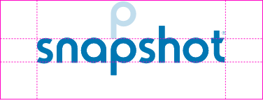
Logo
Display the logo in a positive format (for print, PANTONE® 2935; for digital, #0077B3 (Blue 700); or black) or in a negative format (in white, reversed out of another color). Use a negative format only when the background area is larger than the minimum surround space. One way to protect our logo is by putting a registration symbol (®) next to it—particularly on materials seen outside the company. You don’t need to use a registration symbol on promotional items, signage, or internal documents. The registration symbol should be used in the first mention of Snapshot if the logo isn’t included in the design.
Surround space
Space around the logo helps you see and recognize the logo easier. Minimum surround space should equal the height of the logos “p.”
Color
When in the digital space, remember to always double-check you’re meeting WCAG AA accessibility standards (or above) by using a miniumum contrast checker.
Primary palette
Type
96 Sans is our custom typeface which gives us a completely unique brand identity. It also gives us a way to tie the look and feel of our brand identity across all creative pieces. For a more detailed breakdown of the nuances of type styling, see the full version of the Snapshot Brand Identity.
Headlines
- 96 Sans Bold
- Sentence case
- Black
With Snapshot®, safe drivers can save.
Subhead
- 96 Sans Bold
- Sentence case
- PMS 5405 / Steel Blue 700
It’s easy to drive toward a discount and great savings.
Body Copy
- 96 Sans Light
- Sentence case
- Black
Traditional car insurance rates are based on factors you can’t control, but Snapshot personalizes your rate based on how you drive, how much you drive, and when you drive. In fact, through the years, we’ve handed out over $900 million in discounts to our customers.
Iconography
Icons translate our products into bite-sized, visual nuggets. Like everything else, they are an important communication aid and have guidelines to ensure they make the best impact. Before working with iconography, check out our icon best practices.
Snapshot brand icon
This is our main Snapshot icon. It has a stroke weight of 1px and is typically used between 50-100px or larger. This icon was primarily created to be used within the digital space via the Progressive app. It should be used rarely on other platforms and mediums. In most cases, use the Snapshot logo instead.
Primary icons
Modeled after the primary icon style for the Progressive master brand, Snapshot has its own specific set of icons. These icons should be used at no smaller than 100px. Do not change the color or stroke weight.
Secondary icons
These simplistic icons can be used at smaller sizes, as they have minimal details. They should be used at no smaller than 50px. Again, do not change the color or stroke weight.
CL-Specific icons
Snapshot ProView iconography additionally includes small business-specific CL product icons. For more information on using CL icons, see the Commercial Lines page.
Patterns
These city monoline patterns (of Chicago and Boston) represent the trips our customers take while using Snapshot. These patterns should be used as secondary, textural elements, or as larger graphics on simpler layouts.
Photography
The photography should feature authentic, casual, and airy imagery that reiterates Snapshot’s ease of use.
Environmental considerations
- This can include candid shots of people driving or with their vehicle.
- Be mindful of which side of the road the driver is on, along with the markings (avoid European roads).
Device and mobile considerations
- This imagery should highlight the Snapshot device or app. Photography should show the simplicity of using Snapshot.
- Do not show consumers using their phone while driving.
Illustration
STAY is the name of our service platform with a goal of helping customers stay with Progressive as their needs change. The Chris Anderson STAY illustrations include specific Snapshot versions. These illustrations highlight the easy-to-use Snapshot app and device and can be used across all mediums—when used, they should be the primary focus.
Brand behaviors
Let’s ‘talk’ about Snapshot
We use all seven brand behaviors to create the PGR voice for Snapshot users. However, based on past Snapshot projects, we’ve found that we circle around the following behaviors the most:
Optimistic
Because we’re asking our customers to try Snapshot, we should convey a sense of positivity throughout their journey—sending them encouraging thoughts even if there’s a hiccup along the way.
Clear
Snapshot is a fairly easy product, but there are a number of directions, hurdles, and other conundrums that could be a bit confusing. That’s why we want to be as concise as we can by using everyday language when explaining the steps, the discounts, and the outcomes involved in the process.
Helpful
There may be some questions during a customer’s Snapshot journey. That’s why we need help them by offering a friendly, pleasant, solution-oriented advice along the way.
Keeping it simple: Creating content for PGR
When it comes to writing—whether it’s body copy, headlines, articles or more—one of our general guiding principles for all Progressive communications is to keep it simple. To cut out all of the clutter, bring the main message to the forefront, and keep our content as simplistic and easy-to-read as possible.
That’s why we’ve put together a number of questions for writers, designers, and content creators to ask themselves before, during, and after the creative build:
- Can my message be delivered more succinctly?
- Can any elements be removed from the layout?
- Is my vocabulary as clear and direct as possible?
- Can the content be made more scannable and easier to read?
 Business Areas

 Download logos (.ZIP)
 Minimum Contrast Checker


